主题
网站主题切换原理与实践:CSS 类名切换方案
更新: 11/20/2025字数: 0 字 时长: 0 分钟
在现代 Web 开发中,为用户提供主题切换功能已经成为提升用户体验的重要方式。无论是浅色/深色主题切换,还是多色彩主题选择,都能让用户根据自己的偏好和环境选择最舒适的界面。
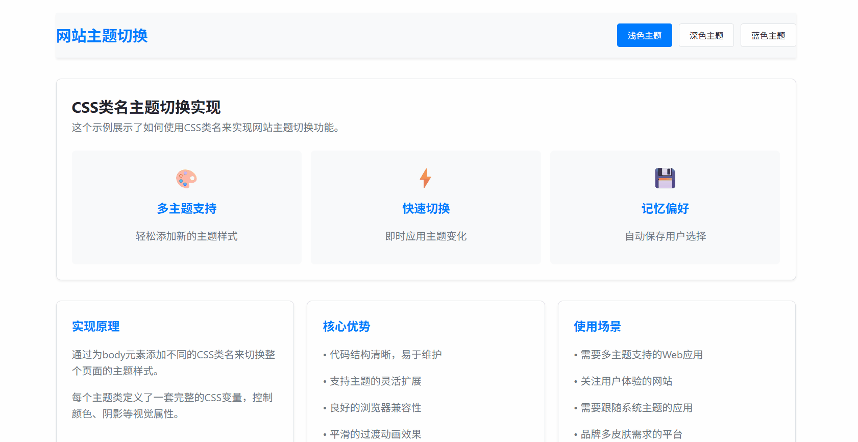
实现效果
一、核心原理
主题切换的核心原理是通过改变 HTML 元素的 CSS 类名,从而应用不同的样式规则。具体来说:
- 定义多个主题样式:为每个主题创建对应的 CSS 类
- 动态切换类名:使用 JavaScript 在运行时切换 HTML 元素的类名
- 样式级联应用:利用 CSS 的级联特性,新类名的样式会覆盖默认样式
二、实现方案
1. CSS 主题定义
首先,我们为每个主题定义一套完整的 CSS 变量:
css
/* 浅色主题 */
.theme-light {
  --primary-bg: #ffffff;
  --secondary-bg: #f8f9fa;
  --primary-text: #212529;
  --accent-color: #007bff;
  --border-color: #dee2e6;
}

/* 深色主题 */
.theme-dark {
  --primary-bg: #121212;
  --secondary-bg: #1e1e1e;
  --primary-text: #e9ecef;
  --accent-color: #4dabf7;
  --border-color: #495057;
}

/* 应用主题变量 */
body {
  background-color: var(--primary-bg);
  color: var(--primary-text);
  transition: all 0.3s ease;
}2. HTML 结构
在 HTML 中,我们设置默认主题并创建主题切换控件:
html
<body class="theme-light">
  <header>
    <div class="theme-switcher">
      <button class="theme-btn active" data-theme="theme-light">浅色</button>
      <button class="theme-btn" data-theme="theme-dark">深色</button>
    </div>
  </header>
  <!-- 页面内容 -->
</body>3. JavaScript 切换逻辑
实现主题切换的核心 JavaScript 代码:
javascript
class ThemeManager {
  constructor() {
    this.body = document.body;
    this.themeButtons = document.querySelectorAll(".theme-btn");
    this.init();
  }

  init() {
    // 加载保存的主题
    this.loadTheme();
    // 绑定事件
    this.bindEvents();
    // 监听系统主题变化
    this.watchSystemTheme();
  }

  bindEvents() {
    this.themeButtons.forEach((button) => {
      button.addEventListener("click", (e) => {
        const theme = e.target.dataset.theme;
        this.setTheme(theme);
      });
    });
  }

  setTheme(theme) {
    // 移除所有主题类
    this.body.classList.remove("theme-light", "theme-dark");
    // 添加新主题类
    this.body.classList.add(theme);

    // 更新按钮状态
    this.updateButtonStates(theme);

    // 保存到本地存储
    this.saveTheme(theme);
  }

  updateButtonStates(activeTheme) {
    this.themeButtons.forEach((button) => {
      button.classList.toggle("active", button.dataset.theme === activeTheme);
    });
  }

  saveTheme(theme) {
    localStorage.setItem("user-theme", theme);
  }

  loadTheme() {
    const savedTheme = localStorage.getItem("user-theme");
    if (savedTheme) {
      this.setTheme(savedTheme);
    }
  }

  watchSystemTheme() {
    if (window.matchMedia) {
      const mediaQuery = window.matchMedia("(prefers-color-scheme: dark)");

      mediaQuery.addEventListener("change", (e) => {
        // 只有用户没有手动选择时才跟随系统
        if (!localStorage.getItem("user-theme")) {
          this.setTheme(e.matches ? "theme-dark" : "theme-light");
        }
      });
    }
  }
}

// 初始化主题管理器
new ThemeManager();三、关键技术细节
1. CSS 变量(自定义属性)的使用
CSS 变量让我们能够集中管理主题相关的颜色、间距等值:
css
:root {
  --transition-duration: 0.3s;
  --border-radius: 8px;
}

.theme-light {
  --primary-bg: #ffffff;
  --text-color: #333333;
}

.theme-dark {
  --primary-bg: #1a1a1a;
  --text-color: #ffffff;
}

.component {
  background: var(--primary-bg);
  color: var(--text-color);
  transition: all var(--transition-duration) ease;
}2. 平滑过渡效果
通过 CSS transition 实现主题切换时的平滑动画:
css
* {
  transition: background-color 0.3s ease, color 0.3s ease, border-color 0.3s ease;
}3. 持久化存储
使用 localStorage 保存用户选择,确保刷新页面后主题保持一致:
javascript
saveTheme(theme) {
    localStorage.setItem('user-theme', theme);
}

loadTheme() {
    return localStorage.getItem('user-theme') || 'theme-light';
}4. 系统主题检测
自动检测用户操作系统的主题偏好:
javascript
watchSystemTheme() {
    if (window.matchMedia) {
        const mediaQuery = window.matchMedia('(prefers-color-scheme: dark)');

        // 初始检测
        if (!localStorage.getItem('user-theme')) {
            this.setTheme(mediaQuery.matches ? 'theme-dark' : 'theme-light');
        }

        // 监听变化
        mediaQuery.addEventListener('change', (e) => {
            if (!localStorage.getItem('user-theme')) {
                this.setTheme(e.matches ? 'theme-dark' : 'theme-light');
            }
        });
    }
}四、进阶功能
1. 主题扩展性
轻松添加新主题:
css
.theme-blue {
  --primary-bg: #e3f2fd;
  --accent-color: #2196f3;
  --text-color: #0d47a1;
}

.theme-green {
  --primary-bg: #e8f5e8;
  --accent-color: #4caf50;
  --text-color: #1b5e20;
}2. 组件级主题支持
为特定组件设置主题:
css
.card {
  background: var(--card-bg, var(--secondary-bg));
  border: 1px solid var(--card-border, var(--border-color));
}

.theme-dark .card {
  --card-bg: #2d2d2d;
  --card-border: #404040;
}3. 性能优化
避免不必要的重绘和回流:
javascript
setTheme(theme) {
    // 使用requestAnimationFrame优化性能
    requestAnimationFrame(() => {
        this.body.classList.remove(...this.body.classList);
        this.body.classList.add(theme);
    });
}五、最佳实践
- 渐进增强:确保在没有 JavaScript 的情况下,默认主题仍能正常工作
- 无障碍访问:为主题切换按钮提供适当的 ARIA 标签
- 性能考虑:避免在主题切换时进行复杂的 DOM 操作
- 测试覆盖:在不同设备和浏览器上测试主题切换功能
- 用户反馈:在切换主题时提供视觉反馈
案例源码
html
<!DOCTYPE html>
<html lang="zh-CN">
<head>
<meta charset="UTF-8" />
<meta name="viewport" content="width=device-width, initial-scale=1.0" />
<title>CSS类名主题切换</title>
<style>
/* 基础样式 */
* {
margin: 0;
padding: 0;
box-sizing: border-box;
/* 实现颜色的过渡效果 */
transition: background-color 0.3s ease, color 0.3s ease, border-color 0.3s ease;
}
body {
font-family: "Segoe UI", Tahoma, Geneva, Verdana, sans-serif;
line-height: 1.6;
background-color: #ffffff;
color: #333333;
}
.container {
max-width: 1200px;
margin: 0 auto;
padding: 20px;
}
/* 浅色主题 - 默认 */
.theme-light {
--primary-bg: #ffffff;
--secondary-bg: #f8f9fa;
--primary-text: #212529;
--secondary-text: #6c757d;
--accent-color: #007bff;
--border-color: #dee2e6;
--card-bg: #ffffff;
--shadow: 0 0.125rem 0.25rem rgba(0, 0, 0, 0.075);
}
/* 深色主题 */
.theme-dark {
--primary-bg: #121212;
--secondary-bg: #1e1e1e;
--primary-text: #e9ecef;
--secondary-text: #adb5bd;
--accent-color: #4dabf7;
--border-color: #495057;
--card-bg: #2d2d2d;
--shadow: 0 0.125rem 0.25rem rgba(0, 0, 0, 0.5);
}
/* 蓝色主题 */
.theme-blue {
--primary-bg: #e3f2fd;
--secondary-bg: #bbdefb;
--primary-text: #0d47a1;
--secondary-text: #1565c0;
--accent-color: #2196f3;
--border-color: #90caf9;
--card-bg: #ffffff;
--shadow: 0 0.125rem 0.25rem rgba(33, 150, 243, 0.3);
}
/* 应用主题变量 */
body {
background-color: var(--primary-bg);
color: var(--primary-text);
}
/* 头部样式 */
header {
background-color: var(--secondary-bg);
padding: 1rem 0;
border-bottom: 1px solid var(--border-color);
box-shadow: var(--shadow);
}
.header-content {
display: flex;
justify-content: space-between;
align-items: center;
}
.logo {
font-size: 1.5rem;
font-weight: bold;
color: var(--accent-color);
}
.theme-switcher {
display: flex;
gap: 10px;
}
.theme-btn {
padding: 8px 16px;
border: 1px solid var(--border-color);
border-radius: 4px;
background-color: var(--card-bg);
color: var(--primary-text);
cursor: pointer;
transition: all 0.2s;
}
.theme-btn:hover {
transform: translateY(-2px);
box-shadow: var(--shadow);
}
.theme-btn.active {
background-color: var(--accent-color);
color: white;
border-color: var(--accent-color);
}
/* 主内容区域 */
main {
padding: 2rem 0;
}
.card-grid {
display: grid;
grid-template-columns: repeat(auto-fit, minmax(300px, 1fr));
gap: 20px;
margin-top: 2rem;
}
.card {
background-color: var(--card-bg);
border-radius: 8px;
padding: 1.5rem;
box-shadow: var(--shadow);
border: 1px solid var(--border-color);
}
.card h3 {
color: var(--accent-color);
margin-bottom: 1rem;
}
.card p {
color: var(--secondary-text);
margin-bottom: 1rem;
}
/* 特性展示 */
.features {
display: grid;
grid-template-columns: repeat(auto-fit, minmax(250px, 1fr));
gap: 15px;
margin-top: 1.5rem;
}
.feature {
padding: 1rem;
background-color: var(--secondary-bg);
border-radius: 6px;
text-align: center;
}
.feature-icon {
font-size: 2rem;
margin-bottom: 0.5rem;
}
/* 页脚 */
footer {
background-color: var(--secondary-bg);
padding: 1.5rem 0;
border-top: 1px solid var(--border-color);
margin-top: 3rem;
text-align: center;
color: var(--secondary-text);
}
/* 响应式设计 */
@media (max-width: 768px) {
.header-content {
flex-direction: column;
gap: 1rem;
}
.theme-switcher {
width: 100%;
justify-content: center;
}
}
</style>
</head>
<body class="theme-light">
<div class="container">
<header>
<div class="header-content">
<div class="logo">网站主题切换</div>
<div class="theme-switcher">
<button class="theme-btn active" data-theme="theme-light">浅色主题</button>
<button class="theme-btn" data-theme="theme-dark">深色主题</button>
<button class="theme-btn" data-theme="theme-blue">蓝色主题</button>
</div>
</div>
</header>
<main>
<div class="card">
<h2>CSS类名主题切换实现</h2>
<p>这个示例展示了如何使用CSS类名来实现网站主题切换功能。</p>
<div class="features">
<div class="feature">
<div class="feature-icon">🎨</div>
<h3>多主题支持</h3>
<p>轻松添加新的主题样式</p>
</div>
<div class="feature">
<div class="feature-icon">⚡</div>
<h3>快速切换</h3>
<p>即时应用主题变化</p>
</div>
<div class="feature">
<div class="feature-icon">💾</div>
<h3>记忆偏好</h3>
<p>自动保存用户选择</p>
</div>
</div>
</div>
<div class="card-grid">
<div class="card">
<h3>实现原理</h3>
<p>通过为body元素添加不同的CSS类名来切换整个页面的主题样式。</p>
<p>每个主题类定义了一套完整的CSS变量,控制颜色、阴影等视觉属性。</p>
</div>
<div class="card">
<h3>核心优势</h3>
<p>• 代码结构清晰,易于维护</p>
<p>• 支持主题的灵活扩展</p>
<p>• 良好的浏览器兼容性</p>
<p>• 平滑的过渡动画效果</p>
</div>
<div class="card">
<h3>使用场景</h3>
<p>• 需要多主题支持的Web应用</p>
<p>• 关注用户体验的网站</p>
<p>• 需要跟随系统主题的应用</p>
<p>• 品牌多皮肤需求的平台</p>
</div>
</div>
</main>
<footer>
<p>© 2024 ThemeSwitch 示例. 所有主题切换均使用CSS类名实现.</p>
</footer>
</div>
<script>
document.addEventListener("DOMContentLoaded", function () {
const themeButtons = document.querySelectorAll(".theme-btn");
const body = document.body;
// 从localStorage加载保存的主题
const savedTheme = localStorage.getItem("theme") || "theme-light";
setTheme(savedTheme);
// 为每个主题按钮添加点击事件
themeButtons.forEach((button) => {
button.addEventListener("click", function () {
const theme = this.getAttribute("data-theme");
setTheme(theme);
// 保存用户选择到localStorage
localStorage.setItem("theme", theme);
});
});
function setTheme(theme) {
console.log("theme:", theme);
// 移除所有主题类
body.classList.remove("theme-light", "theme-dark", "theme-blue");
// 添加当前主题类
body.classList.add(theme);
// 更新按钮的active状态
themeButtons.forEach((button) => {
if (button.getAttribute("data-theme") === theme) {
button.classList.add("active");
} else {
button.classList.remove("active");
}
});
}
// 监听系统主题变化(可选功能)
if (window.matchMedia) {
const darkModeMediaQuery = window.matchMedia("(prefers-color-scheme: dark)");
darkModeMediaQuery.addEventListener("change", (e) => {
// 只有当用户没有手动选择主题时,才跟随系统
if (!localStorage.getItem("theme")) {
if (e.matches) {
setTheme("theme-dark");
} else {
setTheme("theme-light");
}
}
});
}
});
</script>
</body>
</html>